

Product
UX/UI
DESIGN SYSTEMS
LEADERSHIP
LEADERSHIP CHALLENGE
INTERNAL pain points
overview
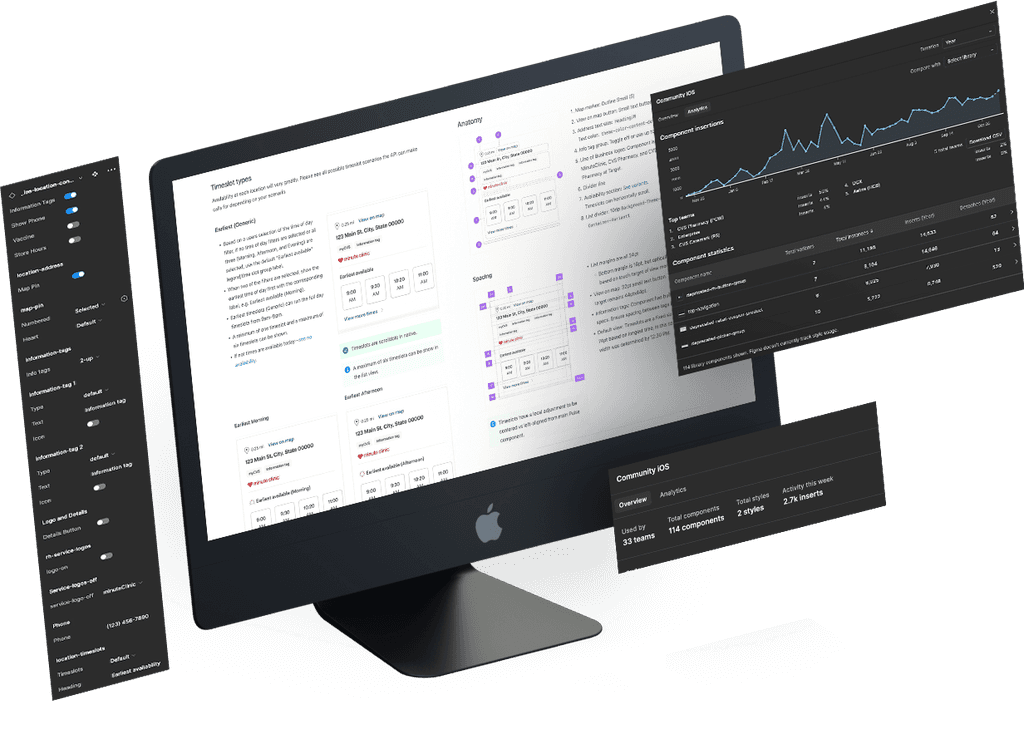
As part of a nimble cohort of design system experts, I served as an embedded web and app domain specialist dedicated to the Scheduling experience. In this role, I mentored 10 designers, championed design consistency, and promoted best practices while strategically selecting components to build and document. Together, the Community Design System team released 245 components across iOS, Android, and Web, all built on the foundation of Pulse Design System tokens and atomic components.
roles
Lead / Sr. Product Designer
Mentor to 10 Product Designers
Web, iOS, Android Domain Expert
Design System Expert
responsibiilties
Led collaborative feature working sessions with designers and team leads to ensure design consistency across multiple lines of business.
Strategically selected design system components at all levels—atomic, molecule, organism, and beyond.
Collaborated closely with Accessibility (A11y), Content, Design Systems, and Engineering teams to align on best practices.
Developed components and authored comprehensive documentation to support their implementation and use.
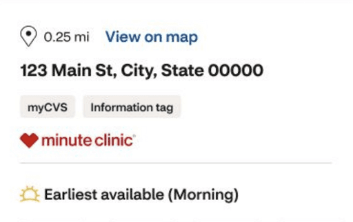
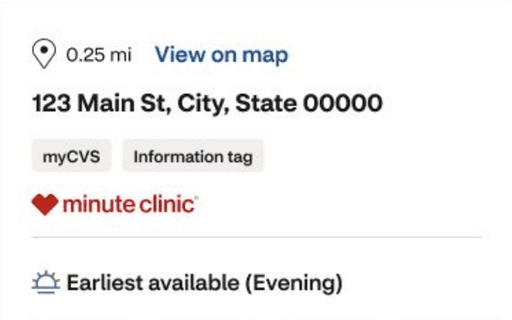
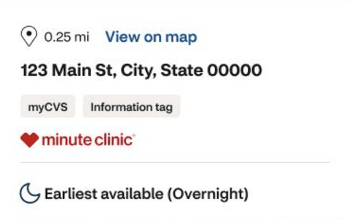
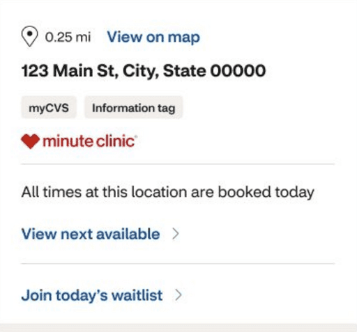
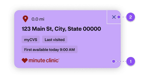
iOS Location List View Overview
Drive quick conversions by presenting the earliest available timeslots while allowing users to progressively explore more options.
All Examples covered in full documentation:
Overview
When to use
Page load
All timeslot types
Anatomy
Spacing
Formatting
Map markers
Content stratgey
Accessibility
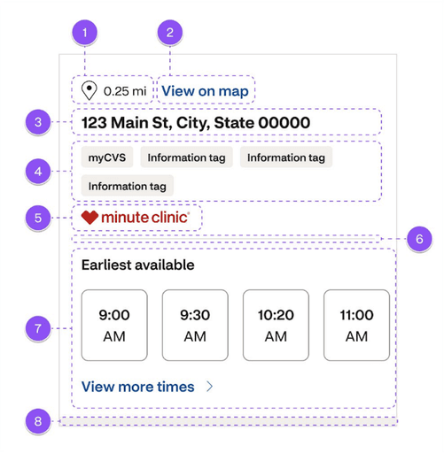
Anatomy
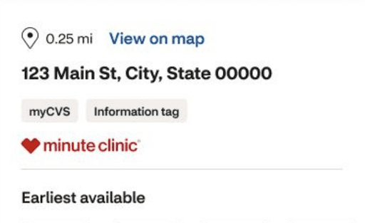
1. Map marker: Outline Small (S)
2. View on map button: Small text button
3. Address text size: Heading/M
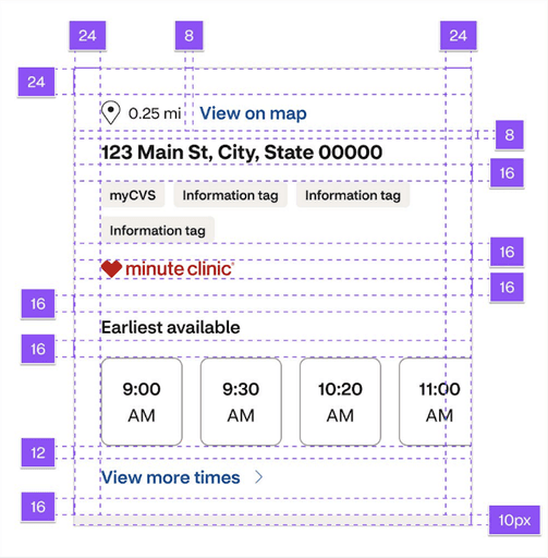
Spacing
List margins 24pt
Bottom margin is 16pt, but optically is 24pt based on the touch target of the "view more" button.
View on map
32pt small text button. Touch target remains 44pt x 44pt.
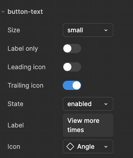
Figma Component Properties
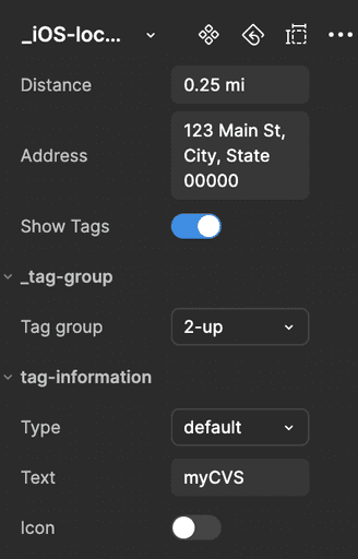
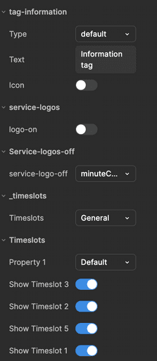
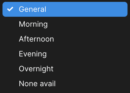
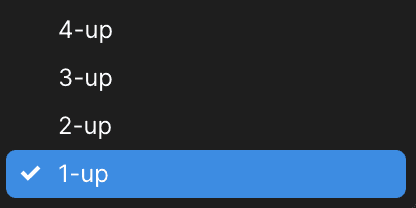
Timeslot variants

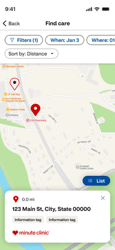
iOS Location Map Dialog Overview
Displays salient information over the map in a modeless dialog that allows users to quickly navigate to timeslots for a selected location.
All Examples covered in full documentation:
Overview
Anatomy
Spacing
Size
Interactive Areas
Accessibility
Anatomy
Tile: Effects: Shadow Large
Icon
Distance
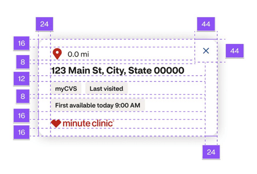
Spacing
Actions must have a touch target of 44pt x 44pt.
The inner spacing left and right is 24pt.
The inner spacing on top is 24pt, and the bottom is 16pt.
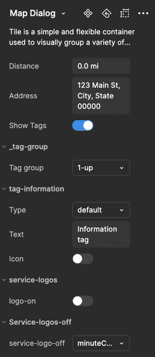
Figma Component Properties
Interaction
areas
The entire dialog is tappable.
The close button dismisses the dialog and simultaneously deselects the map marker. Ensure the close button has a minimum tap target area of 44pt x 44pt.
contributions
Comprehensive native app upskilling course on progressive and staged disclosures
Native disclosures
A pattern that organizes information and actions across several screens or sections.
Understanding the difference between progressive and staged disclosure can allow us to determine which pattern will create the most usable experience.
All Examples covered in full course:
Progressive and staged disclosure overviews
Design intent
Benefits
Related patterns
Competitive Audit
Comparison Matrix
Wire and visual examples
5-question quiz
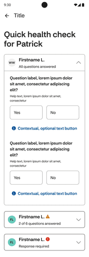
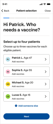
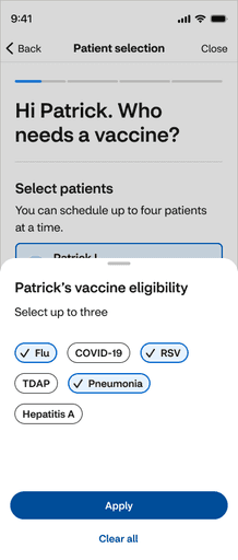
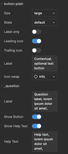
Android Questionnaire Overview
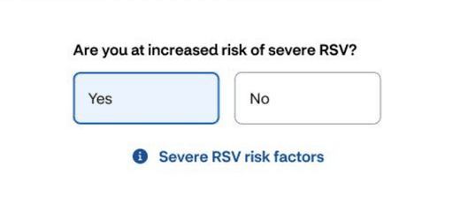
Captures relevant patient information for both individuals and groups to help providers give the best possible and accurate care.
All Examples covered in full documentation:
Overview
When to use / not to use
Types
Anatomy
Spacing
Content strategy
Component states
Accessibility
Anatomy
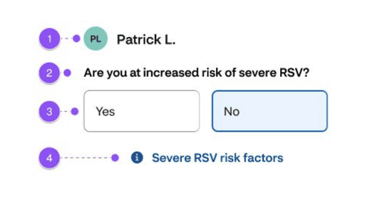
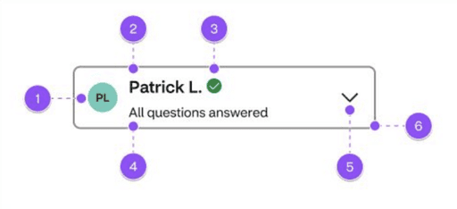
Avatar
Label – Paragraph M Strong
Choice buttons grid 2-column
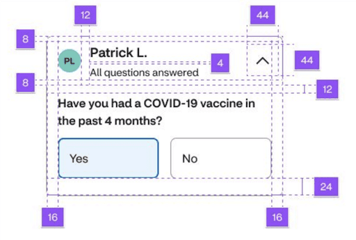
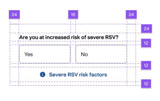
Spacing
Disclosure angle must have a touch target of 44pt x 44pt.
Container inner spacing is 16pt left and right:
8pt top
24pt bottom
Figma Component Properties
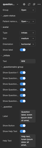
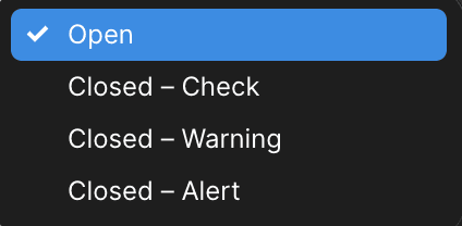
Status Variants
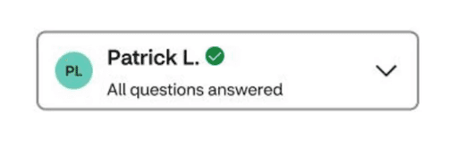
Use the check icon when the user has closed the disclosure and has answered all of the required questions.
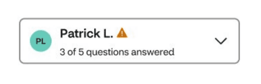
Use the warning icon when the user has closed the disclosure and has answered some required questions.
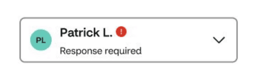
Use the alert icon when the user has closed the disclosure and has not answered any of the required questions.
Component States
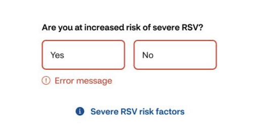
Error state after submission with missing required field.
Selected state of a button
details
Deliverables
36 component builds across Web, iOS, and Android.
24 documented components, organsims, and templates
details
Metrics
35.2K Inserts for the Android Info Tag component
While on the Core Pulse Design System team, I conducted research, performed competitive audits, and contributed to the final build and documentation for implementation across all digital teams at CVS.
Collectively, my team contributed 245 components to the Community Design Sytem
We launched components across web, iOS, and Android kits.
65,398 total component inserts across all platforms from the Community Design System team.
case closed
What I Learned
Design systems are a communal effort, relying on layered collaboration across operations and subject matter experts to build, deploy, develop, refine, and iterate. They are never truly finished and demand a pace that matches the needs of dynamic teams.
Working as an embedded designer gave me firsthand insight into the challenges designers face when dealing with feature work and design system pitfalls. Observing and addressing everything from local components to global patterns is central to crafting a successful strategy.
Adopting a nimble mindset—working light, shipping quickly, and iterating rapidly—is essential. Remember, the users of a design system are a melting pot of designers and developers, whose tools ultimately shape the end-user experience.
The maturity of a design system determines where and when you can take risks or adopt out-of-the-box patterns. Striking the delicate balance between creating a scalable, adaptable system and delivering best-in-class experiences is key to building a harmonious and effective design ecosystem.
some reviews from colleagues
"Chris is an exceptional product design lead who combines kindness, collaboration, and creativity to elevate any team. He excels at translating product visions into stunning, detailed designs, and his openness to ideas fosters a supportive and innovative work environment. His talent and dedication make him an invaluable asset to any organization."
★★★★★
JENNA RODRIGUES
Product Design Lead
some reviews from colleagues
"Chris always puts 110% in on all of his work. He is always open to feedback, fosters collaboration like nobody's business, and just brings joy to the [virtual] room. He is the complete package — an amazing designer, a thought provoker, a true team player."
★★★★★
Jennifer anderson
sr. content strategist
Read All Reviews